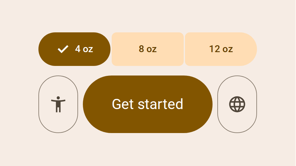
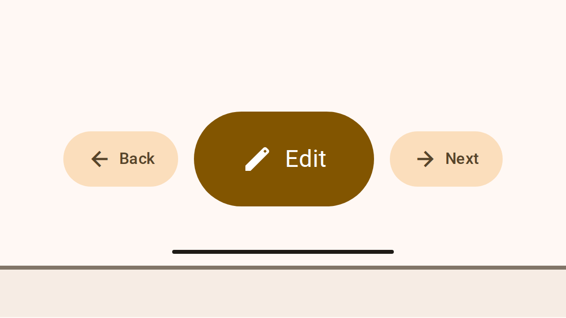
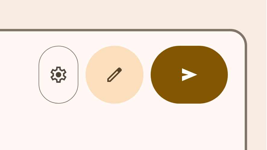
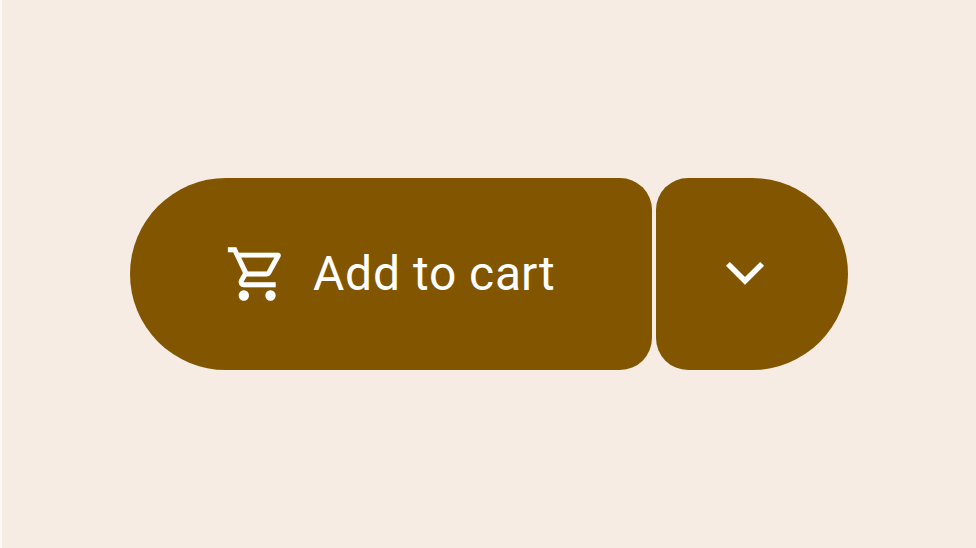
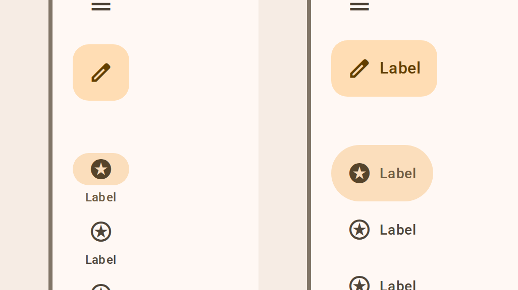
Button groups organize buttons and add interactions between them
Buttons prompt most actions in a UI
Icon buttons help people take actions with a single tap
Split buttons open a menu to give people more options related to an action
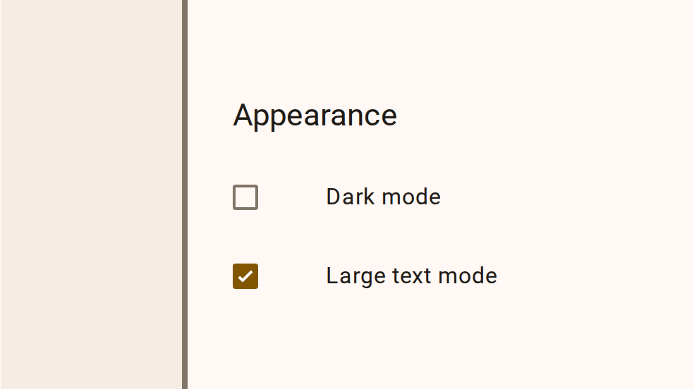
Checkboxes let users select one or more items from a list, or turn an item on or off
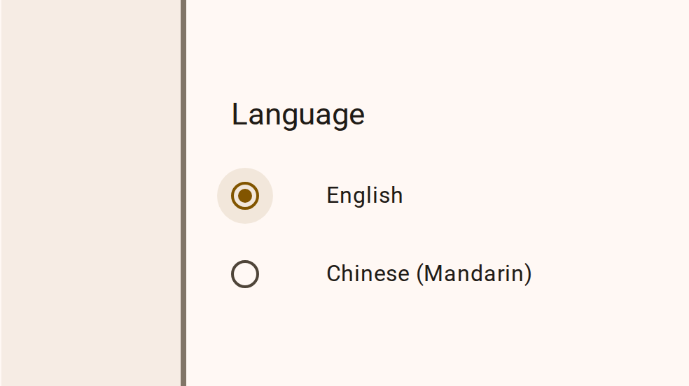
Radio buttons let people select one option from a set of options
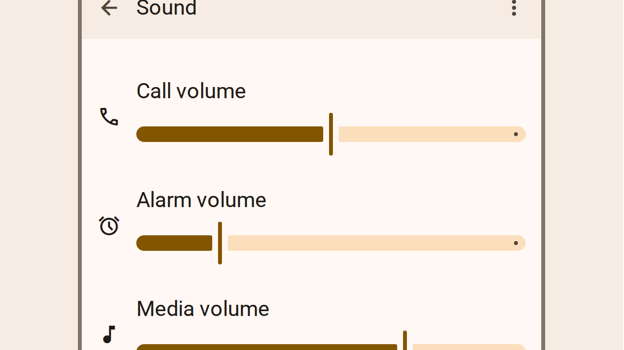
Sliders allow users to make selections from a range of values
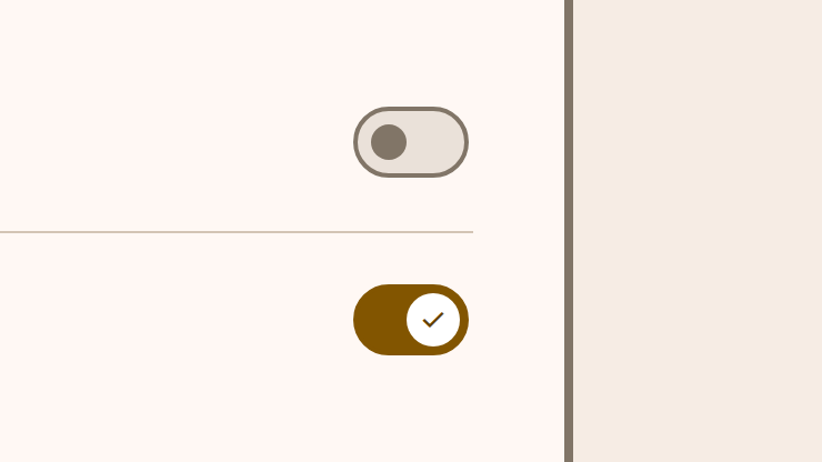
Switches toggle the selection of an item on and off
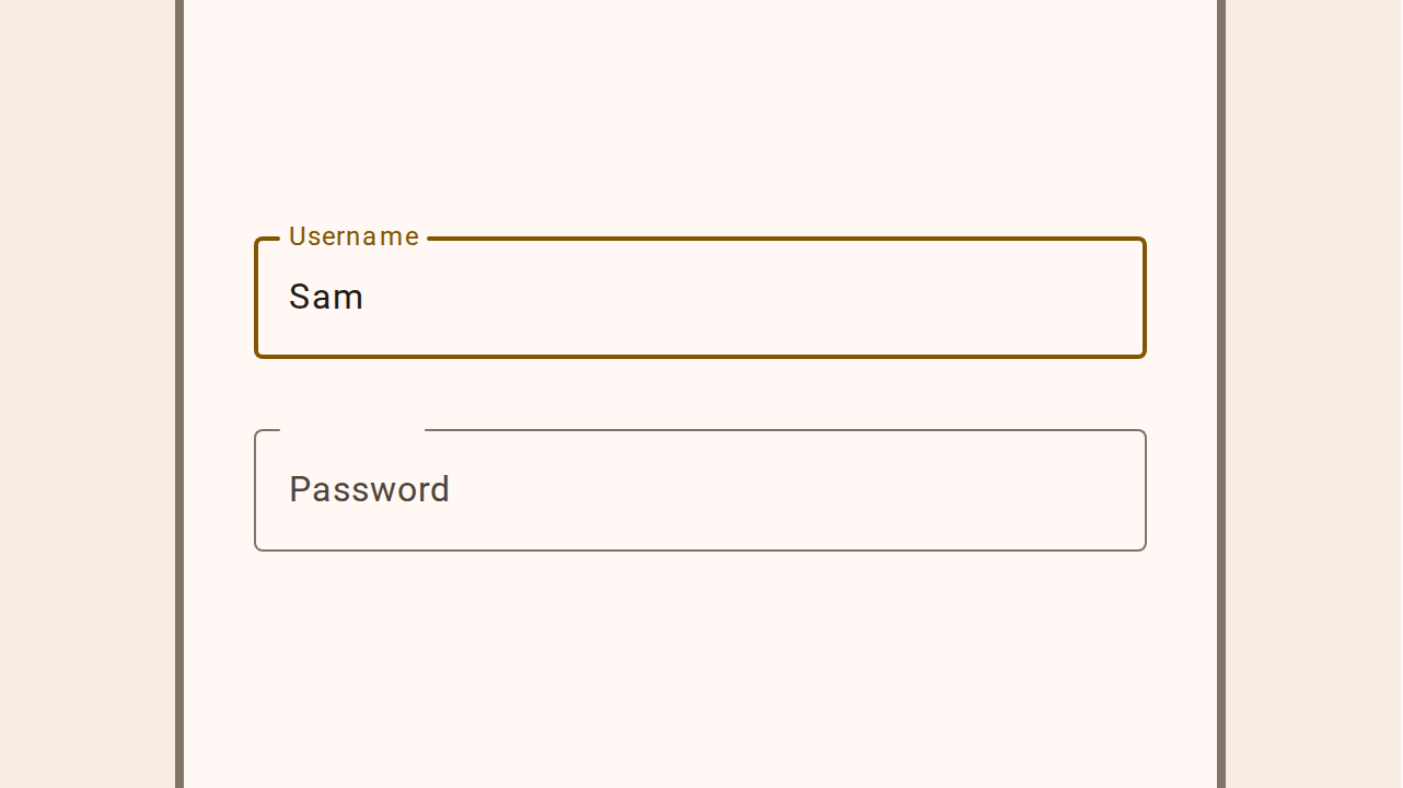
Text fields let users enter text into a UI
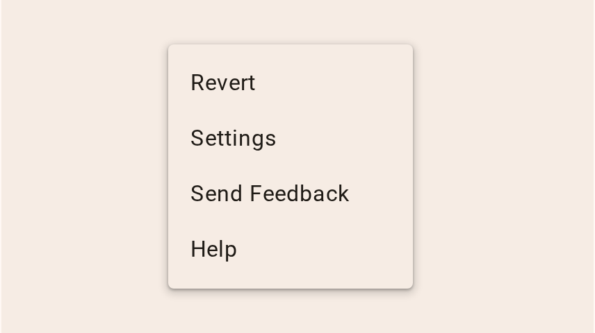
Menus display a list of choices on a temporary surface
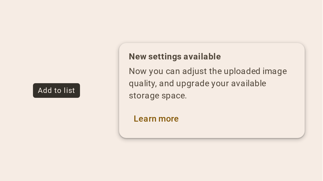
Tooltips display brief labels or messages
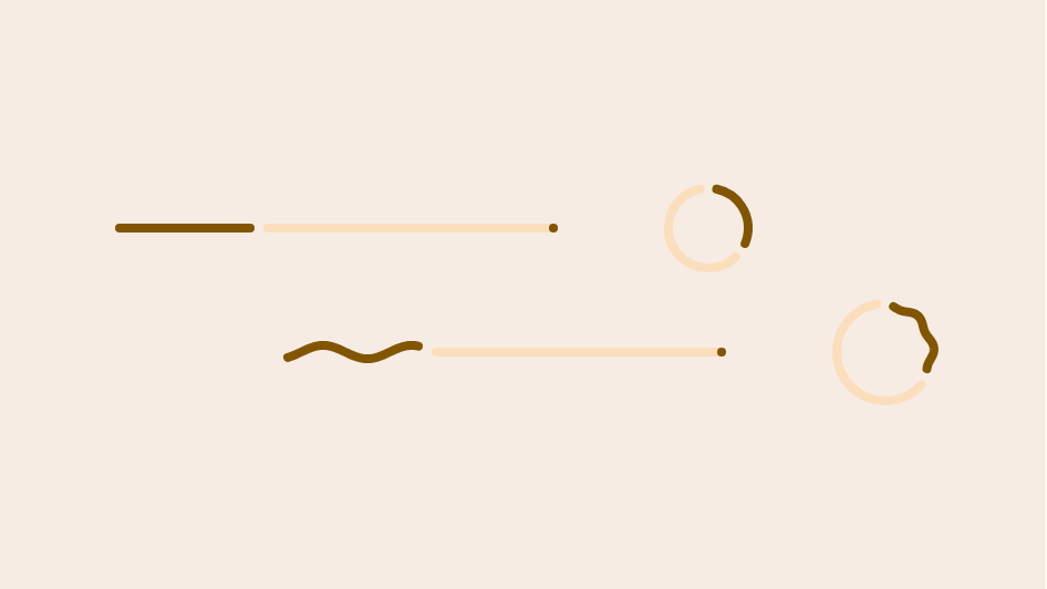
Progress indicators show the status of a process in real time
Navigation rails let people switch between UI views on mid-sized and larger devices
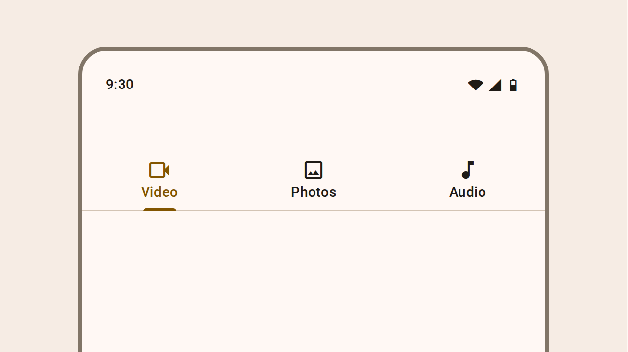
Tabs organize content across different screens and views
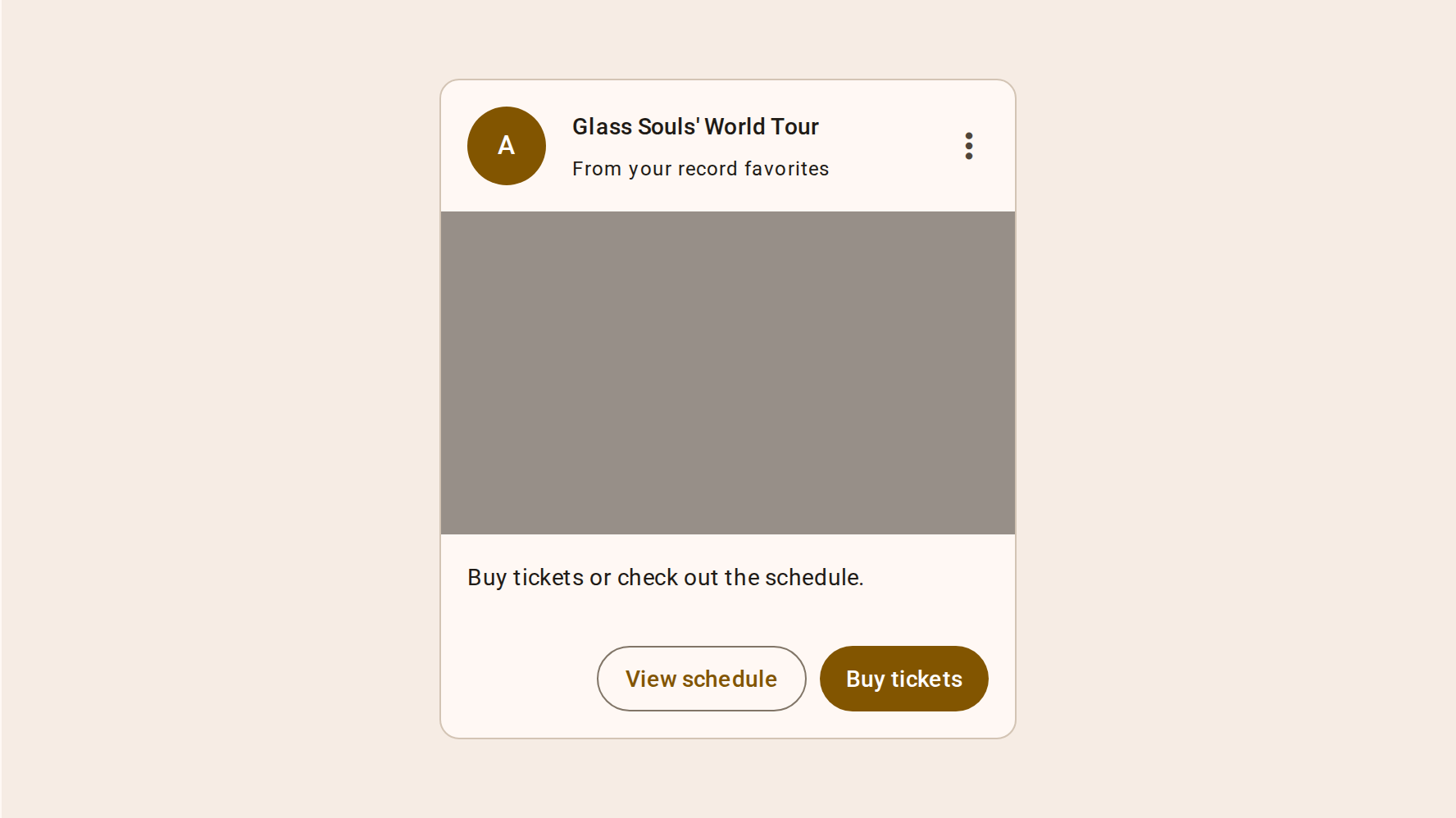
Cards display content and actions about a single subject
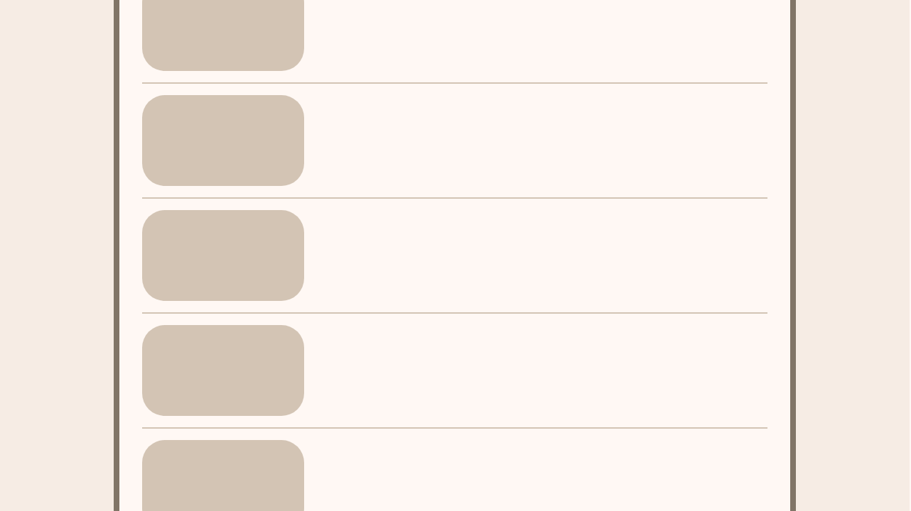
Dividers are thin lines that group content in lists or other containers
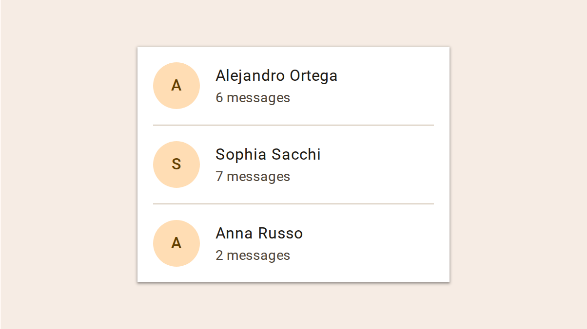
Lists are continuous, vertical indexes of text and images
Icons represent ideas through an abstract pictograph